
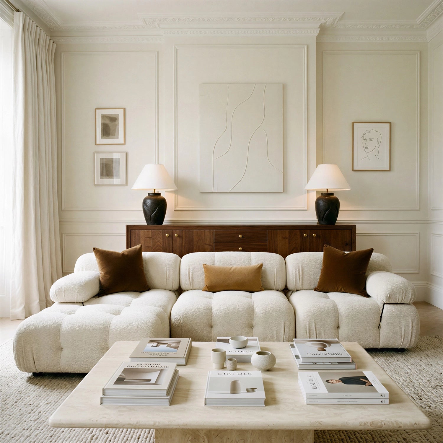
Sale −17%Bestseller
Only 3 left
DeliveryWhite-glove delivery & assembly free on orders over $1,500
NewThe Autumn Edit has arrived — 40+ pieces in walnut, oak & bouclé
SaleThe Autumn Sale — up to 40% off, for a limited time
Tokens, type and components behind every screen — warm, editorial, trustworthy. Toggle light/dark and device modes to see the system respond.
Primary leads (header, footer, hero, headings), Secondary acts (CTAs, links, sale highlights, active states), Accent warms (section tints, cards). Hover/pressed shades, lines and status colours are derived. All text pairs meet WCAG AA.
Playfair Display carries headings and hero statements; Lato carries buttons, labels, prices and nav. Body copy is warm and plain-spoken — no lorem, ever.
Solid wood, natural fibres and honest craft — furniture made for slow mornings, long dinners and every quiet moment in between.
4:5 imagery, hover image swap, quick-add + quick-view, wishlist heart, sale & stock states. Skeleton shows on every data load.
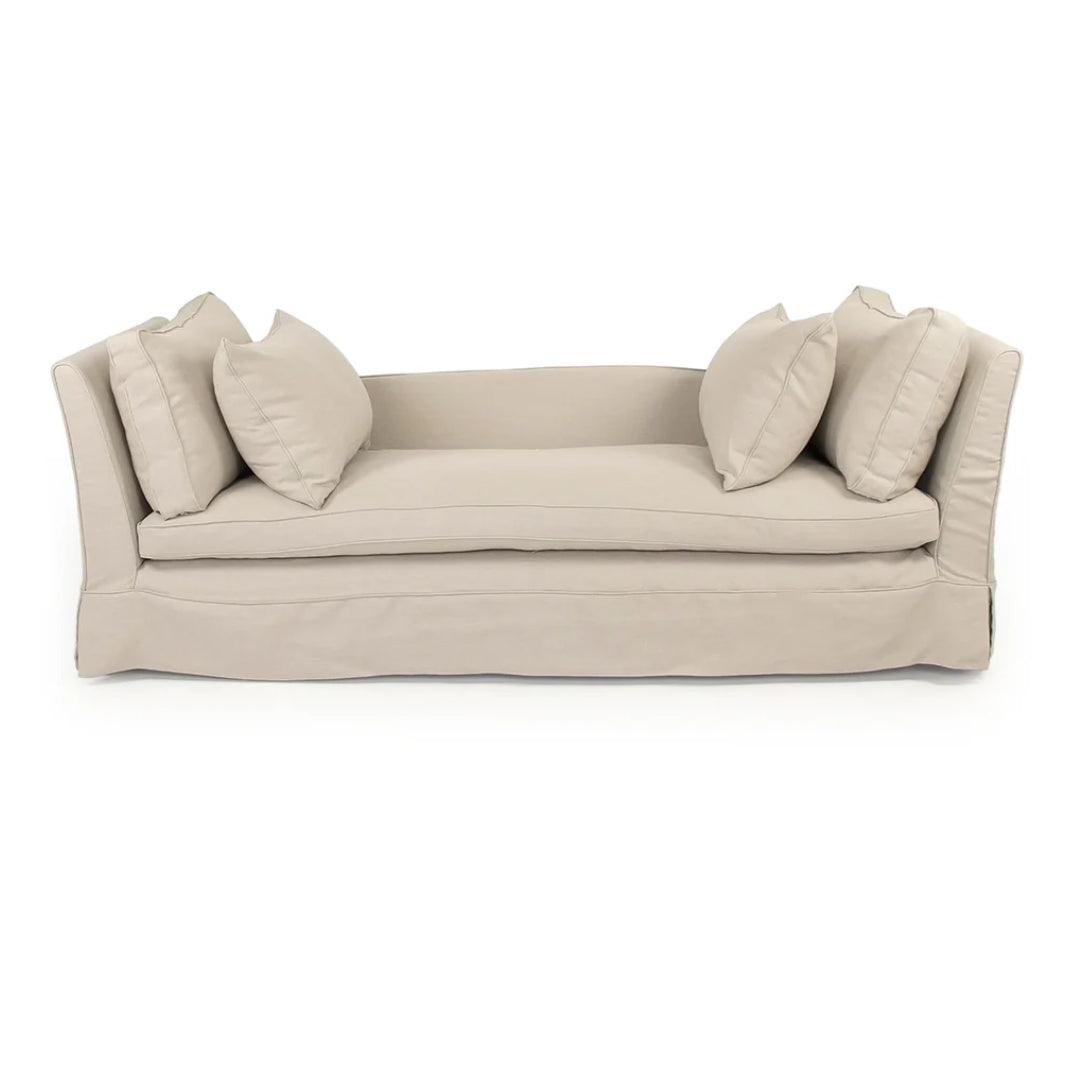

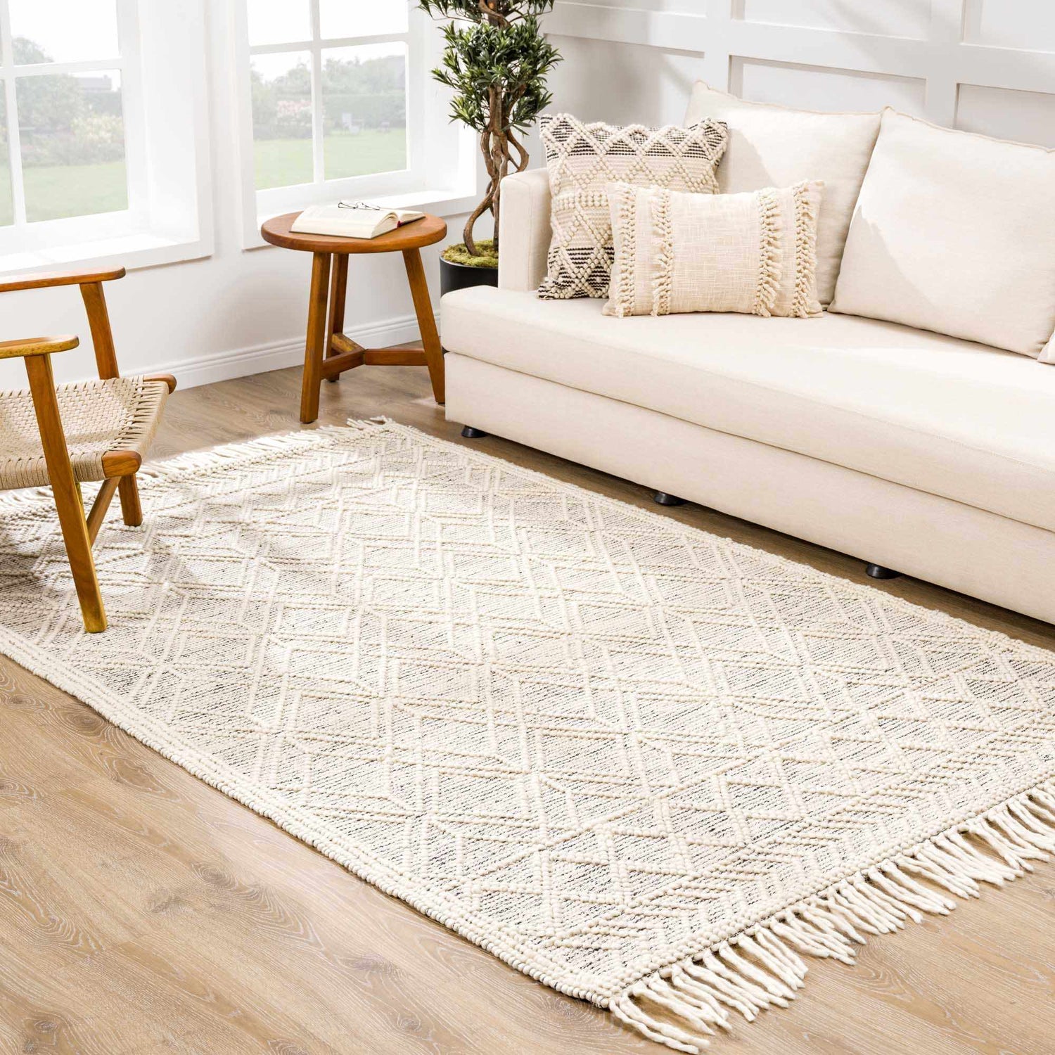
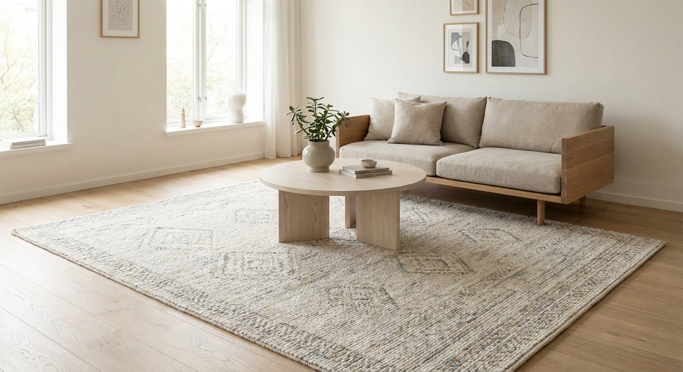
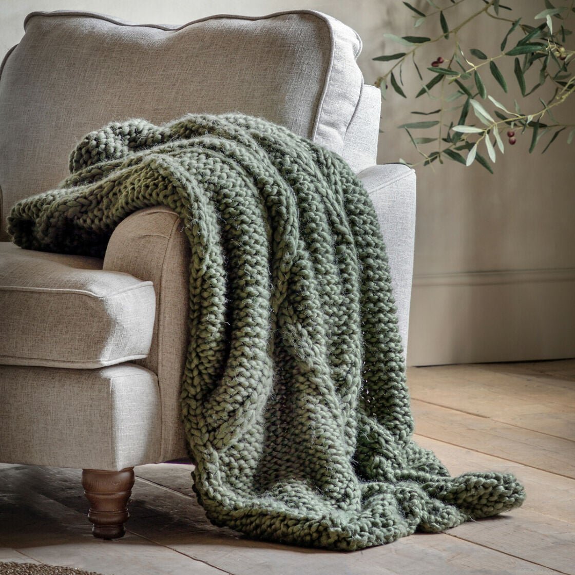
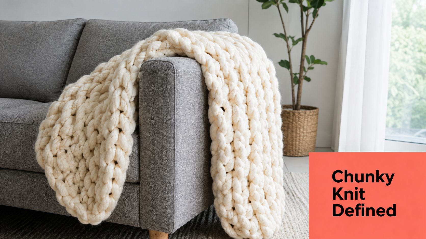
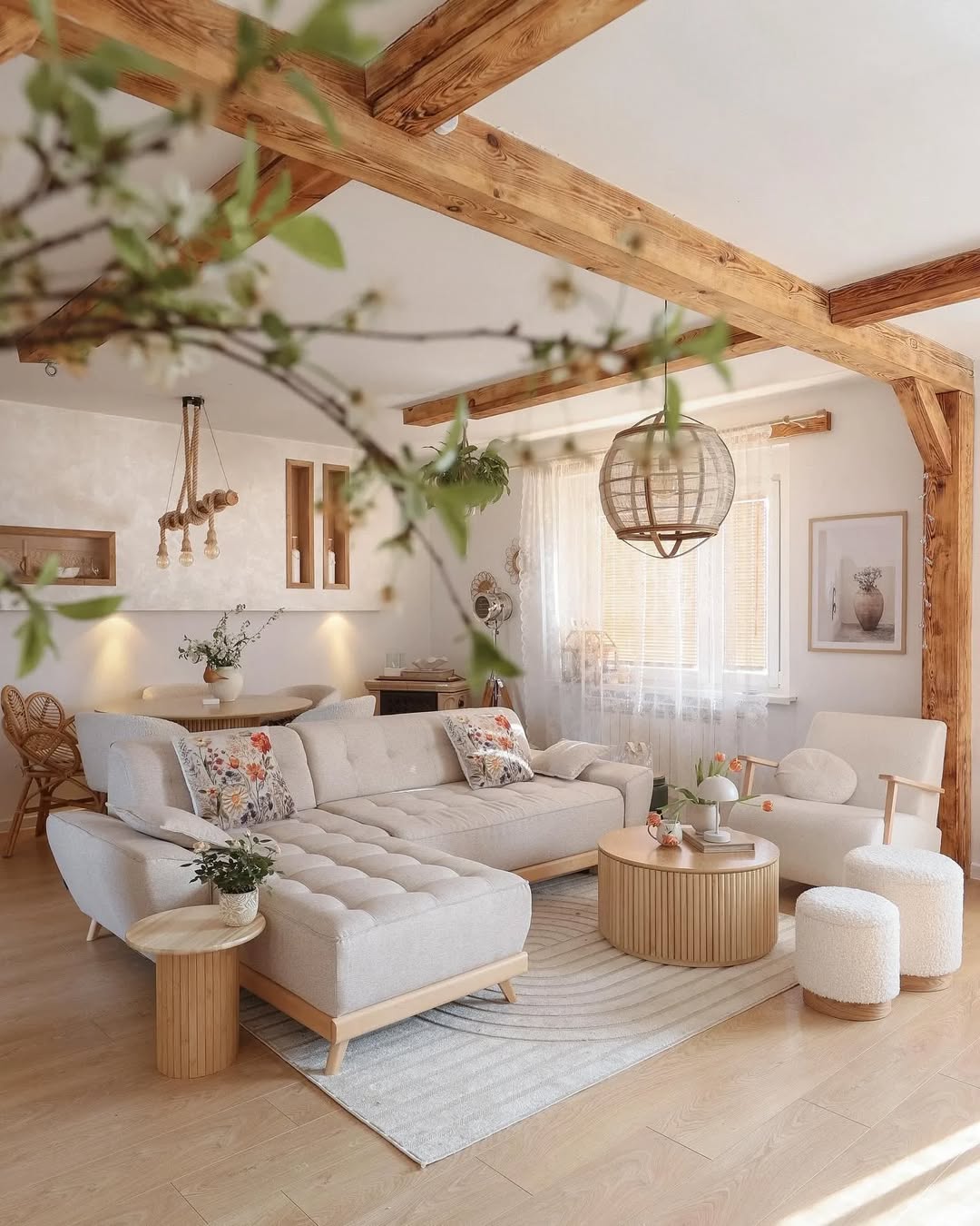
View in your space — an AR placeholder CTA ships on every PDP (data-needs-backend="ar-viewer"). Hotspot dots pulse at 2.4s on rgba(249,246,240,.28) rings; popover cards reuse product-card tokens. Material swatches swap gallery images with a 300ms crossfade.